Impact
EVA is design system Evolution that combines visual language with technical implementation, components and application guidelines.
Development Velocity
50% faster screen design iteration
30-40% reduced UI component implementation time
UI Consistency & Quality
80% reduction in button variants (20+ → 4 core types)
95% visual consistency across product surfaces
Workflow Efficiency
40% fewer layers in core design files
70% decrease in duplicate text styles
Flexibility & Maintainability
100% design styles managed via tokens
90% code styles synced with tokens
Simplified Light/Dark theme implementation
Team Alignment
100% components fully documented
Established cross-functional DS governance
Challenges
Fragmentation and Inefficiency
Our existing Material Design-based UI Kit failed to address product-specific needs and created operational friction:
Inconsistency
Discovered 11 different button variants, though only 4 were actually needed.
Confusing for Staff
Employees wasted time figuring out how each part worked.
Slow & Costly Development
Building new features or fixing things took forever because developers rebuilt the same pieces.
Hard to Update
Changing one thing often broke others.
Solution
Showcase Vision and Roadmap
We established core pillars
for an effective Design System
Atomic architecture
Implemented Atomic Design structure: Assets, Foundations, Atoms, Molecules, Organisms, Templates for modularity.
Centralized documentation
CentraCreated a single source of truth with component specs, principles, and edge cases.
Token-driven foundation
Shifted to design tokens for style management (color, typography, spacing) and theme support (Light/Dark).
System thinking
Standardised spacing, border radius, typographic scale, and elevation.
Cross-functional collaboration
Align on component API and structure
Establish sync tools (Figma API/plugins)
Define DS governance and contribution workflows.
Process
I started EVA by defining why we needed it and what rules it should follow. Then I architected the system — tokens, components, docs.
Designed the key UI pieces, especially the hard back-office tools. Bridged design and dev daily, reviewed code for UX quality. Convinced the team it was worth it, trained them, supported rollout. Also managed the backlog, priorities, releases, and documentation.
Finally, tracked the metrics to prove success and guide what came next.
Before
Design → development → “oops” → redesign
After
Research → Design → Build → Release
Metrics before
Component Usage Rate
23%
Total layers
91,654
Text styles
68
Button variants
14
Dark theme
None
Specs
None
Roadmap

Structure

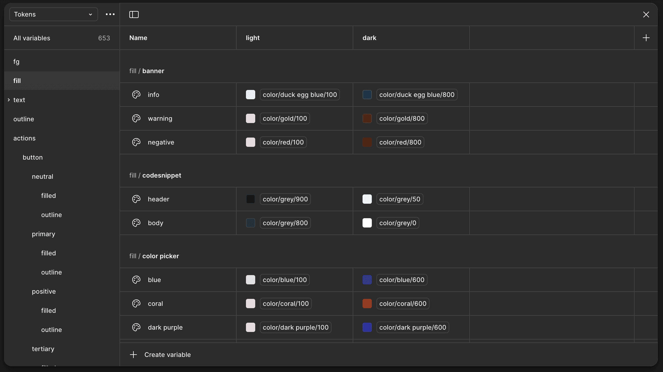
Design Tokens
Critical work enabling flexibility
and consistency
"Foundations" repository
Central token storage with clear taxonomy. Source of truth for designer and developers.
Core tokens:
palette: blue/50 - 900, red/50 - 900
sizing: opacity, radius, gap, padding, adaptive
tokens: foreground, fills, border, text, effects



Metrics after
Component Usage Rate
23% ➝ 89%
Total layers
91,654 ➝ 35,875
Text styles
68 ➝ 33
Button variants
14 ➝ 6
Dark theme
Light & Dark
Specs
Done